
Some of you have read my recent free story Into Deep Waters. Right now it has the generic cover for the Love is Always Write event of the M/M Romance Group on Goodreads, for which it was written. As more and more wonderful stories are being released there, it’s getting confusing, since the same cover is used for all 140+ stories. So even though I like the group design, I wanted a separate and specific cover, particularly since I hope eventually to make this story available from other book sites. The photo for which the story was written is not public domain and I haven’t been able to track down who has the rights. I needed a different cover image, but the inexpensive stock photo sites didn’t turn up anything similar so…
Enny Kraft, who generously gave me a free cover for my story Within Reach, made me a bunch of possible covers. They were all great and I simply couldn’t decide on one. So I thought it would be fun to let you all have a look and vote on them.
I’ve numbered the covers 1-5. (BTW, if you see an odd swirl or circle on a picture – that is a watermark that will be removed when we actually buy the picture for final use. Watermarked free pictures let artists try out different stock photos before paying for their final choices.) Please leave me a comment with the number of your top choice for this story, and any comments or suggestions you have. On Monday the 28th I’ll tally up the votes and see where we stand. Which of these covers would make you pick up this book, and would fit the story you’ll find inside? You tell me.
#1:
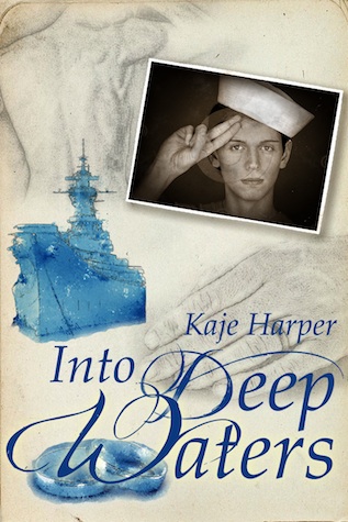
.
#2
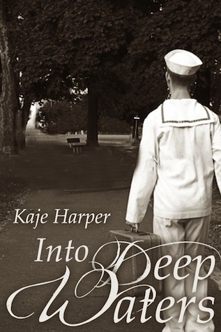
.
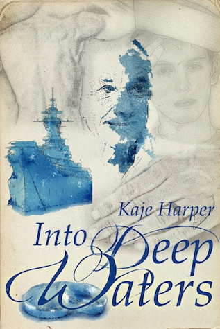
#3
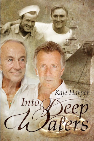
.
#4
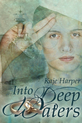
.
#5
.
So what do you think? # 1, 2, 3, 4, or 5? I hope you had fun admiring Enny’s beautiful work and choosing a favorite.
***new question*** I love the rings on the covers, but then I know how the story plays out. The prompt will be at the front but… were any of you in doubt about the ending? Are the rings giving too much away for someone who hasn’t read this? I love the look, but don’t want to be too spoilery.
Number 3 !!! Please ? Please ?
😀
#2. Simple and tasteful. Very nostalgic. No facial splodgies or stock photo overload.
Kaje they are all very beautifully done but my favourite is #3. Suggests that the story spans over this period of time with these two gorgeous men.
Number 2 for me – simple and emotive
I like #1 the best. #3 is great, but almost too specific to the story and implies that the characters are that age during the majority of it.
Hello Kaje,
I really think #3 is Perfect for your Cover of, “Into Deep Waters”
It is so fitting in depicting your story, 2 young men who fell in Love on a ship during WW II on a US Naval Ship……& 60 years laters.
Love the dual photos of then & now, the ship in the background & set of Wedding Rings up front.
Just Perfect!
Take Care Kaje & Have a Great Weekend,
PaParanormalFan Renee
paranormalromancefan at yahoo dot com
Thanks for all the opinions so far – one thing that has come up on the Goodrads blog is the question of the guy’s salute, which is not US Navy – we’ve found one other picture that could maybe be substituted for him in the same covers, so if you like the layout but not that guy, tell me so. We might make a change there.
I love all the comments, thank you.
Hmm. I haven’t read it but I really like #4.
#2! Gorgeous job, Enny! 🙂
Wow! I love them all. They are beautiful! But I have to say, #3 with the older couple is just amazing.
I vote #1, very beautiful all though!
I vote #2 🙂
Well, I’m glad I’m not the only one who likes them all – no real consensus yet. But the comments and votes are great.
I thought for sure that I could pick just 1…after all, its not my story and I have a bit of distance right? NOT!! First off I liked #3, then #4 grabbed me(though I do not like the guy as he is to..to tween looking for me) I really like the ship in the background. I think #3 is the best fitting with the blurb of the story though so I guess I have to go with #3! Whew… made it! BTW – great story Kaje. As a taster to the event this one set me to salivating for the rest of the stories, Just like a good appetizer should eh?
My favorite is number 3.
I didn’t read it yet but I like #3 a lot. It’s not very often that you see older guys on a cover but I like the feeling it gives me when I think about those two being together for so long. #2 would be an option, too, but the rest…I don’t like the guy there (but that’s just my personal opinion ^^). So, #3, please! ^^
I have just come back to have another look (just to make sure I was happy with my choice lol!) and again I cannot take my eyes of no:3. I think it depicts the two perfectly – such beautiful men <3
I love #1
Hi, havn’t read yet but from the blurb would go for either 1 or 3. Have downloaded and looking forward to reading over the weekend.
#3 basically describes the entire story and as such doesn’t provide much mystery, whereas #2 really highlighted Daniel’s return to Jacob for me and I think would convey more of a sense of anticipation for the reader new to the story.
#2 gets my vote. There is a simplicity to it that I think works well.
#1 is my favorite